Our Brand Guidelines
Built for Today.
Engineered for the Future.
A Trusted Partner for Your IoT Journey.
At Robustel, our brand reflects reliability, innovation, and trust – values that extend across every product, partnership, and communication. These brand guidelines are designed to help our distributors and partners present Robustel consistently and confidently, ensuring customers experience the same high standard wherever they encounter our name. By following these guidelines, you’ll help us build a unified global presence while making your own marketing and sales efforts stronger, clearer, and more impactful.
Correct Logo Use
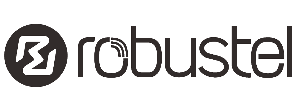
Our logo is the face of Robustel – the primary visual expression that we use to identify ourselves. When using the Robustel logo, please use it correctly following the below guidelines.
Clear space prevents type, imagery or other graphic elements from interfering with the legibility of our logo. No graphic elements should encroach the border around the logo mark. This space is determined by the red circle in the logo mark on each side. (Relational to the size of the logo for application, eg. web vs large wall print).
Measure the clear space for primary logo mark by the height of the logo text.
Which logo to use depends on the background colour and production method.
When using the logo on a white background, you can use the full-colour or, if monotone is required, the black version.
For black or red backgrounds, you can use the all-white versions. Please only use Robustel red for red backgrounds. (See below for required colour palette).
Do not use the logo over a busy or multicoloured background unless in the specified style shown in the social media section below.
Download logos here:
Full-Colour
Black
White
Typeface Family
For all web and print materials in English, please use the typeface family Inter.
https://rsms.me/inter/download/
When to Use:
Inter SemiBold
is the font used for headings, across print and online.
Inter Regular
is to be used for standard body text, across print and online.
Inter Medium Italic
can be used for subheadings where appropriate, or to emphasise important information.
Brand Colours
Our colour palette is a core part of the Robustel identity — bold, modern, and instantly recognisable. These colours help communicate our values of reliability, innovation, and industrial strength across every touchpoint. By using the palette consistently in your marketing materials or promotions, you help ensure that our customers experience a unified Robustel brand, which strengthens our partnership, the trust customers place in your business, and our solutions.
Primary Reds
We use our primary red shades to reinforce brand recognition, and create strong visual impact across digital and printed materials. Can be used for header images, icons and to highlight key information.
CMYK: C:0 M:90 Y:94 K:0
HEX: #EF412A
RGB: R:239 G:65 B:42
CMYK: C:4 M:99 Y:81 K:0
HEX: #E4233B
RGB: R:228 G:35 B:59
CMYK: C:20 M:99 Y:100 K:10
HEX: #B72326
RGB: R:183 G:35 B: 8
Neutrals
The Neutral shades provide
a point of balance to the Reds,
and provide the clean, balanced foundation for all layouts. This ensures clarity, readability, and a consistent visual structure.
CMYK: C:61 M:52 Y:50 K:21
HEX: #626465
RGB: R:98 G:100 B:101
CMYK: C:65 M:66 Y:64 K:64
HEX: #332C2B
RGB: R:51 G:44 B:43
CMYK: C:0 M:0 Y:0 K:0
HEX: #FFFFFF
RGB: R:255 G:255 B:255
Secondary Colours
Our secondary colours – navy blue, light grey, and mid grey – are complementary accents used to help organise information, differentiate sections, and bring a calm, technical sophistication to our designs.
CMYK: C:98 M:78 Y:36 K:24
HEX: #153F64
RGB: R:21 G:63 B:100
CMYK: C:21 M:16 Y:16 K:0
HEX: #C9CACA
RGB: R:201 G:202 B:202
CMYK: C:21 M:16 Y:16 K:0
HEX: #8B8B8C
RGB: R:139 G:139 B:140
Social and Blog Images
Our social media images use a semi-desaturated photographic style paired with a bold red banner overlay and the white Robustel logo. This treatment ensures strong visual consistency across platforms while allowing our brand colour to stand out. By reducing the image saturation, the red overlay gains maximum contrast and impact, creating a distinctive look that catches the eye and makes Robustel instantly recognisable in busy social feeds.
The red and grey overlay opacities can be tweaked and different shades of red and grey from the Robustel colour palette can be substituted, depending on the background image used and what provides the best contrast and depth.


Example 1 and 2
Red overlay: #ef412a
Opacity set to 100% Multiply
Grey overlay: #626465
Opacity set to 60-70% Multiply
Example 3 and 4
Red overlay: #b72326
Opacity set to 90% Normal
Grey: #626465
Opacity set to 60-70% Multiply
Event and Use Case Photography
When taking social media/promotional photos at Trade Shows or other events, please follow these guidelines:
• Make sure the Robustel product(s) can be seen clearly; good lighting, no blurry photos.
• Ensure we can see the productsʼ place in the technology stack. (If applicable).
• For use case images, photograph the environment the product is being used in – check the surrounding area looks as clean and tidy as possible.
• Similarly, for event photographs, no drink bottles, food, personal belongings, etc. should be visible.
• You are welcome to display Robustel branding alongside your own, especially when sharing a trade show stand. To avoid confusion, please refrain from displaying
competing products alongside Robustel’s.
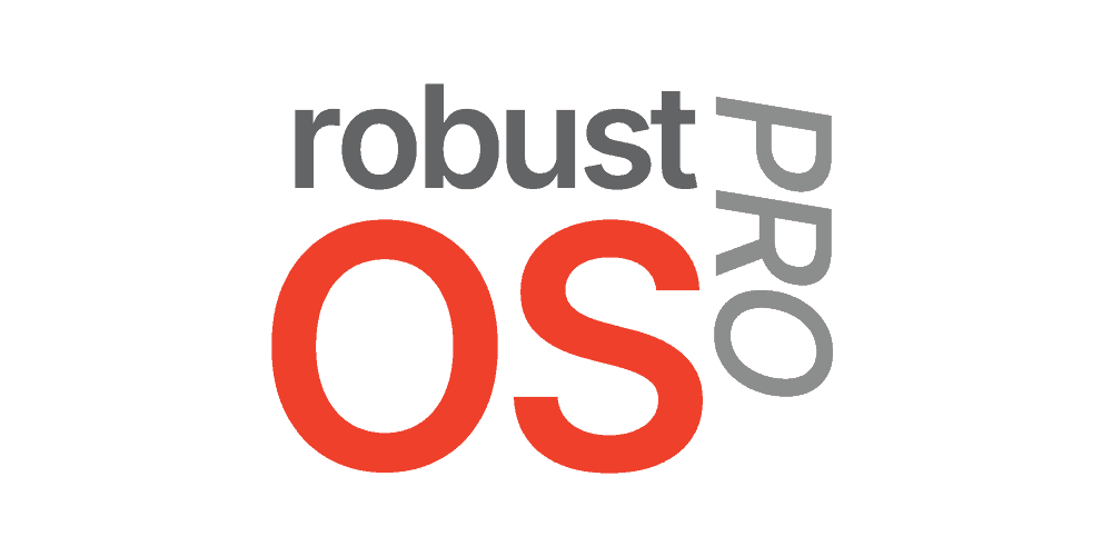
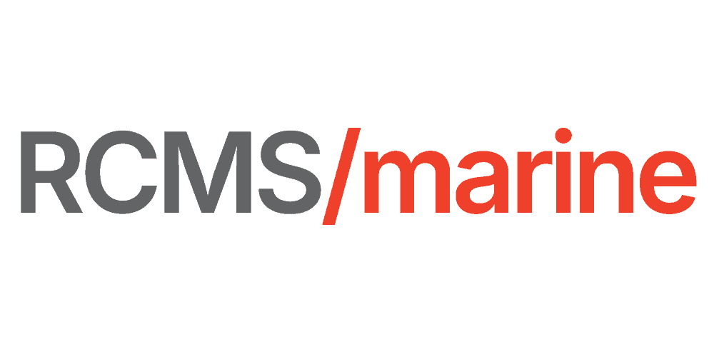
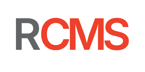
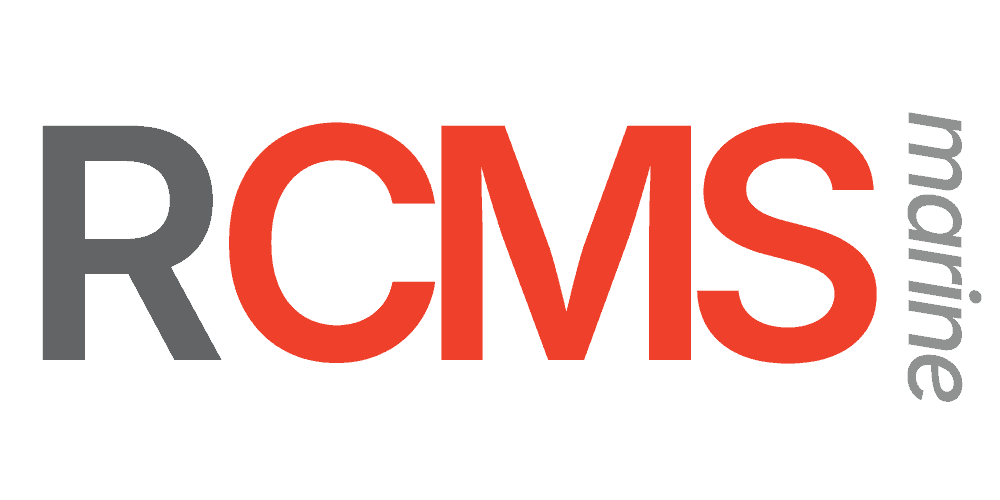
Our Software Logos
Our software logos are designed as a unified family, available in both wordmark and stack form for flexible use options.
Each set represents Robustel’s software ecosystem; Operating Systems, Applications, RCMS Core Platforms, and RCMS Applications, while maintaining a consistent visual identity across the Robustel ecosystem. They use shared geometry, colour cues, and typographic style to ensure instant recognition and alignment with the wider Robustel brand. This consistency helps users understand how each software product relates to the platform as a whole, while still allowing individual icons to stand out in their respective contexts.
Operating Systems Wordmark
Operating Systems Stack
Applications Wordmark
Applications Stack
RCMS Core Platforms Stack